 Go back
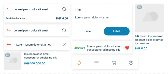
Our UI/UX design team developed a pattern library based on user needs and preferences to enhance recognition, familiarity, and delight. Through research and usability testing, we identified key design components that resonate with users.
We curated reusable UI elements—buttons, navigation, form fields, and microinteractions—ensuring consistency while maintaining flexibility. Intuitive layouts, visual hierarchy, and subtle animations create a seamless, engaging experience.
With clear documentation and ongoing iteration based on feedback, our pattern library fosters trust, brand recognition, and a more enjoyable user journey.
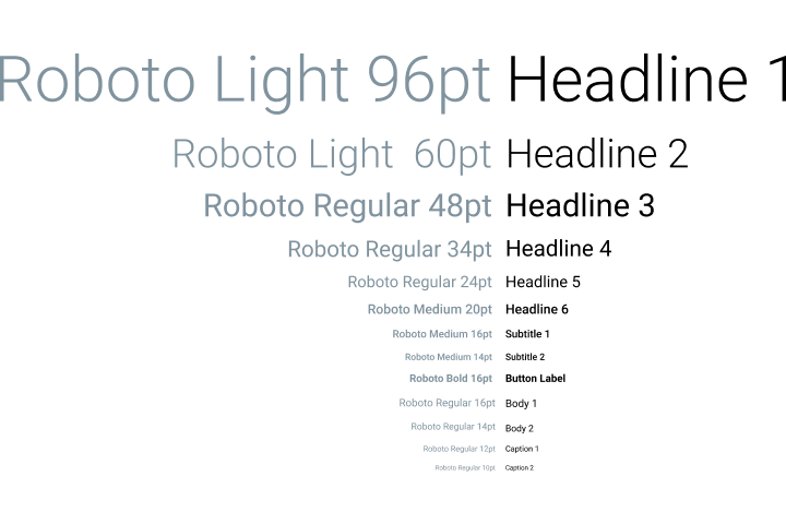
Our team incorporated the Roboto font into our pattern library for its balance of readability, flexibility, and compatibility.
Its clean, modern design enhances legibility across devices, while its versatile weights ensure visual hierarchy and consistency.
Optimized for both web and mobile, Roboto maintains clarity at any size, supporting a seamless and accessible user experience.
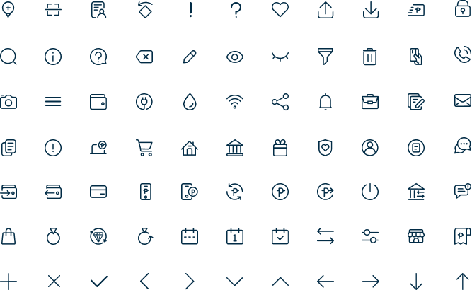
The team created a custom set of line icons as our official iconography to enhance readability and visual clarity.
The minimalist, scalable design ensures consistency across interfaces while maintaining a modern aesthetic.
To improve user familiarity, we crafted symbols that align with common financial concepts, making navigation intuitive for users of financial products. Each icon was designed with simplicity and recognizability in mind, ensuring quick comprehension and a seamless user experience.
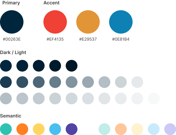
We integrated Cebuana’s brand colors into the design library to ensure consistency and strong brand recognition across digital products. We developed a structured color palette, defining primary, secondary, and accent colors for hierarchy and accessibility.
To enhance usability, we incorporated semantic colors for key system feedback—green for success, red for errors, yellow for warnings, and blue for information.
This ensures clarity in user interactions, making notifications and status indicators instantly recognizable. By applying colors consistently across UI elements, users can easily associate them with the brand while improving overall navigation and comprehension.
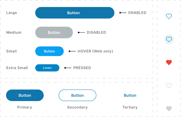
We crafted buttons that are intuitive and accessible, especially for less tech-savvy users. We ensured clear visual hierarchy with distinct colors, sizes, and shapes to indicate primary, secondary, and tertiary actions.
To enhance usability, we focused on concise and action-driven UX copy, avoiding jargon and making button labels straightforward (e.g., “Submit” instead of “Proceed”). We also incorporated visual cues like icons and hover effects to reinforce meaning, ensuring users can easily understand and interact with the interface.
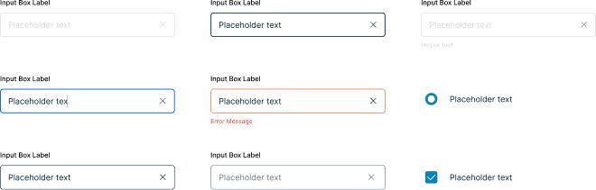
We designed forms to be highly intuitive and user-friendly for all types of users. We ensured a clear structure with logical flow, readable labels, and sufficient spacing to reduce cognitive load.
To enhance usability, we incorporated inline messages, placeholder hints, and real-time validation to guide users and prevent errors.
Clear error states and success messages provide instant feedback, ensuring a smooth and frustration-free form-filling experience.
Our UI/UX design team developed UI templates to streamline the creation of pages and digital products, ensuring speed, consistency, and efficiency.
These pre-designed templates follow our pattern library, maintaining a cohesive structure while allowing flexibility for customization.
By using reusable components and standardized layouts, we enable faster design iterations and seamless developer handoff. This approach reduces development time, minimizes errors, and ensures a unified user experience across all digital products.